Towards the end of Henry VIII's reign very little building occurred in England. The debts run up by the spendthrift Henry meant that the country verged on bankruptcy.
The wool trade, which had carried the economic life of the country in the late medieval period, was no longer as prosperous as it had been and there was less disposable wealth for architectural projects.
Under Elizabeth, the county's economy began to revive. The new queen encouraged a return to farming, and the resulting recovery put a reasonable amount of wealth into the hands of a large number of people.
This new wealth expressed itself in two simultaneous building booms; a great number of small houses were built, and at the same time numerous country mansions were constructed. Many of the earlier medieval or Tudor manors were remodelled and modernised during Elizabeth's reign.
At a glance - Elizabethan Manors
~ Symmetrical layout
~ long gallery
~ formal gardens
~ E plan
The style adopted by the country house builders was a curious blend of Italian Renaissance tempered with large doses of Dutch influence. Indeed many builders relied heavily on books illustrating Dutch building plans and architectural details. This influence is most readily seen in the curved gables so often used in the Elizabethan period.

The courtyard design so prevalent during the medieval and Tudor period gave way to an open plan in the more settled Elizabethan period. The gatehouse, if it was used at all, was purely ornamental.
The most common manor plan was an E shape, with the vertical line of the E being the main hall, and the shorter horizontal end lines the kitchens and living rooms. The shorter central line was the entry porch. There is likely little truth in the old maxim that the E-plan was a tribute to Elizabeth; it was a natural evolution of the earlier courtyard designs.
On the upper floor of the main hall a new architectural feature made its appearance; the long gallery. Used for entertaining, as a family area, for exercise on dull days, and as a portrait gallery, the long gallery was an almost universal feature of Elizabethan manors. It featured windows on three sides and fireplaces along the fourth, and it usually ran the entire length of the floor.

The most important point to note in manor design is that the hall and the living areas had swapped status; the hall was now lesser used, while the long gallery and other living areas were now the centres of family life. The main entry became the most ostentatious and elaborate part of the manor house; it was here that the wealthy man felt most free to lavish his wealth. Entries were often a curious mix of heraldic pretension and classical columns, profuse carvings and ornate decoration.
The material of choice for those who could afford it was once more stone; brick suffering in popularity as the full influence of the Italian Renaissance began to be felt. Elizabethan chimney stacks reflect this influence; they were often built to resemble classical columns and were square in section, as opposed to the twisting, corkscrew patterns of the Tudor years. These chimneys were often clustered in groups of two or three.

house
Windows were generally large, made up of a multitude of small rectangular panes separated by thin mullions. For the first time in centuries, windows show no arching but use a simple dripstone or classical hood moulding.
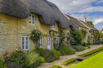
The smaller Elizabethan houses were less influenced by Renaissance motifs. They continued to evolve slowly from the Tudor style; fireplaces and chimneys were more common, and staircases featured more prominently. Half-timbering was common, particularly in regions where stone was scarce or expensive.
The timbers were spaced more widely apart than in Tudor years, allowing more elaborate infill decoration. The overall plan of the small Elizabethan house was simple; a central hall, now floored in halfway to the roof, creating an upper story. On either side of the hall were the living area and the kitchen.
The most common decorative motif of this period is strapwork, used both internally and externally. Carved in low relief, or moulded in plaster, the strapwork creates symmetrical geometric patterns that are the unmistakable trademark of the Elizabethan era.
Other popular decorative touches include moulded plaster panelling, coloured marble (often seen in a black-and-white chequerboard pattern on floors), curvilinear columns, and plaster ceilings moulded in imitation of Gothic fan vaulting.
Related:
Tudor architecture
article © David Ross and Britain Express
Illustrations are based on those in the wonderful volume 'The Observer's Book of British Architecture', by John Penoyre & Michael Ryan, London, 1951


